First of all, thanks to everyone that supported and submitted their entries for the Round 1 of the Tech Shirt design contest! I was a tough, but we finally selected the 15 Finalists to battle for the Soleus GPS Watch!
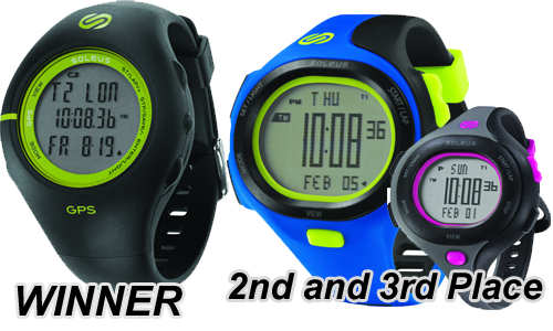
We need everyone’s help for this round! Please VOTE for 3 (THREE) of your top design choice out of the 15 finalists.
Thanks for VOTING! Hope you can share and re-tweet this to your friends, their VOTE will be a lot of help!
Please leave a comment or suggestion about some improvements on the designs, we’ll take them into consideration in the final adjustments.
NOTE: Winners of this round does not guarantee production of the shirts. Final output may vary. Voting Period: Feb 1 to Feb 8, 2012


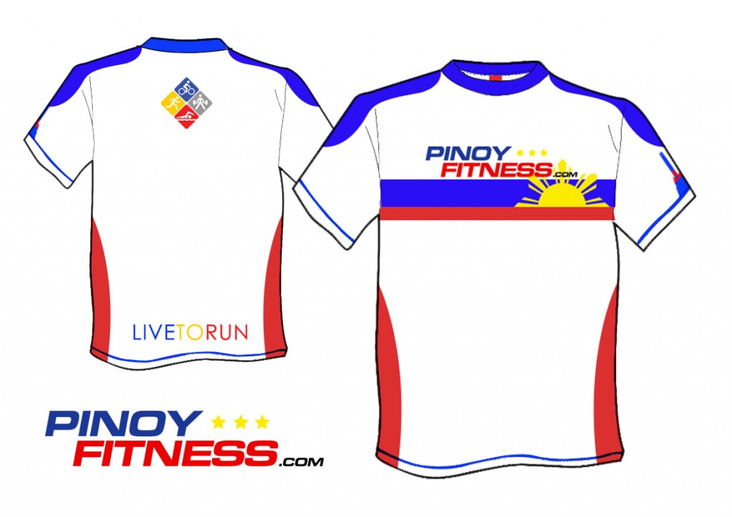
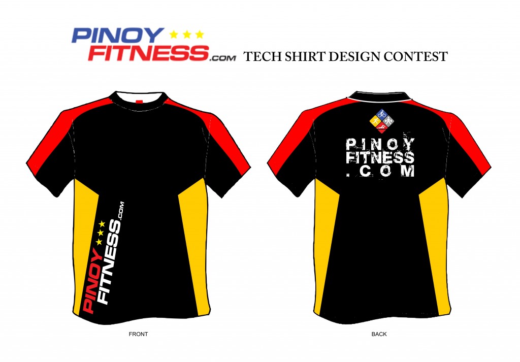

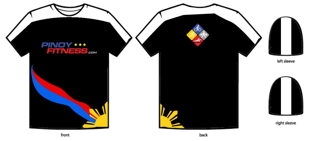
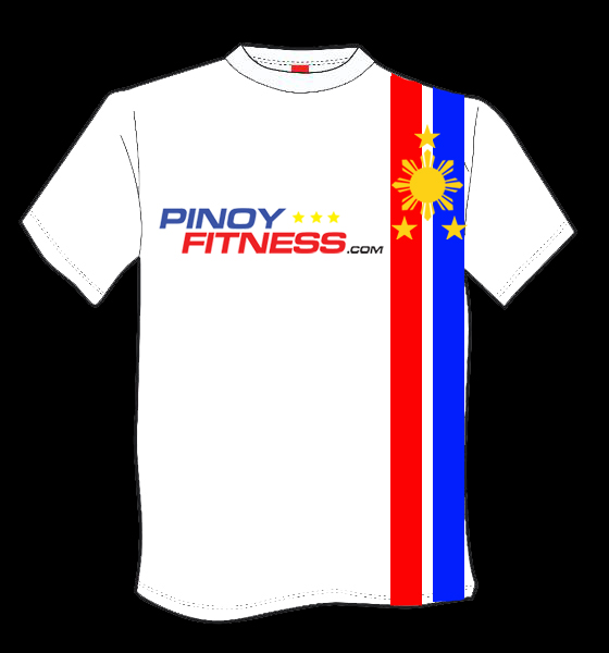
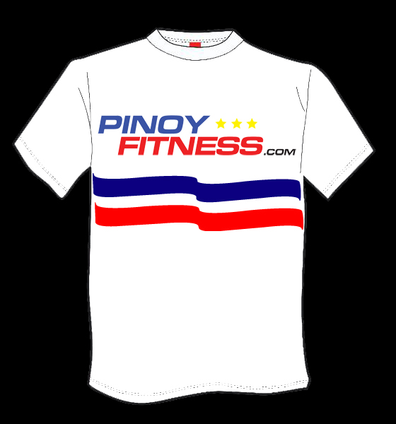
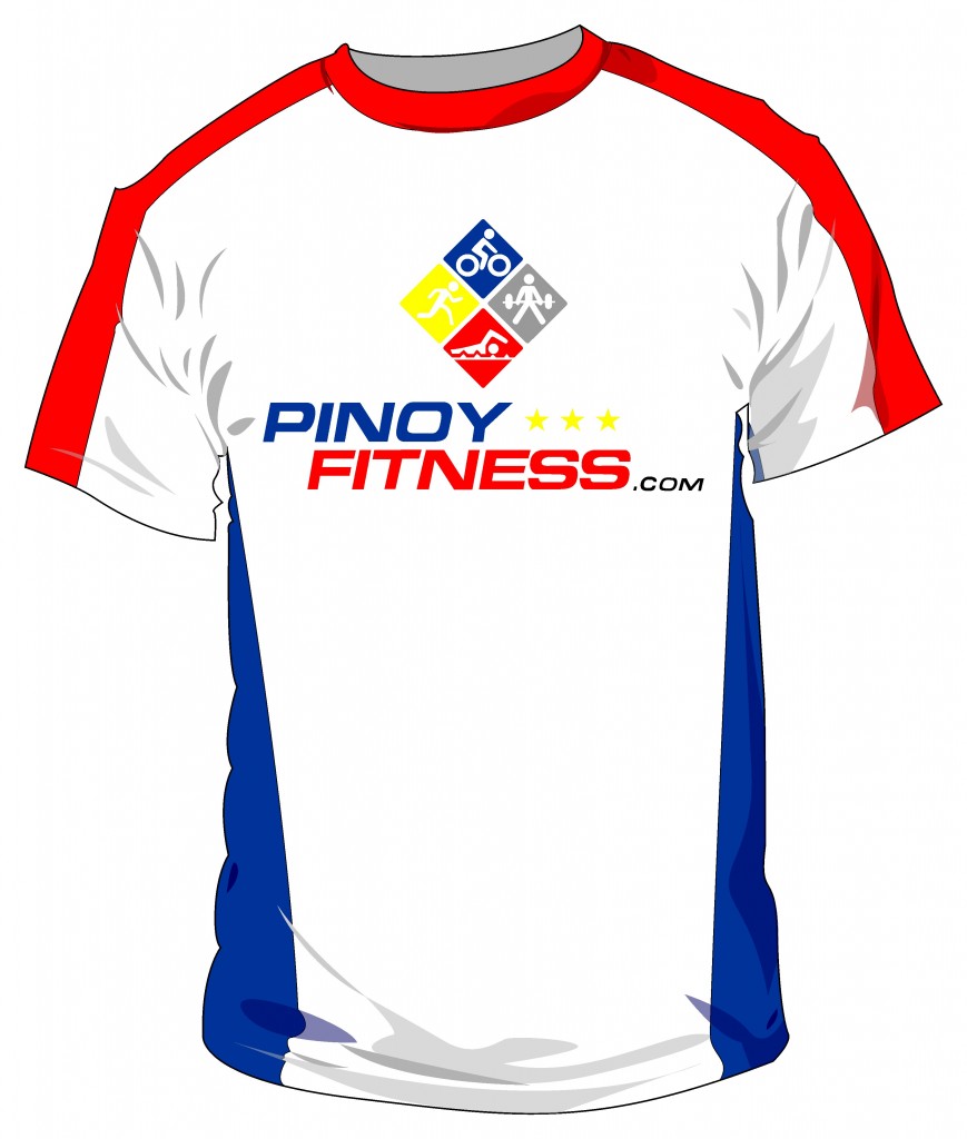
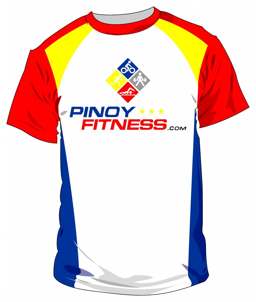
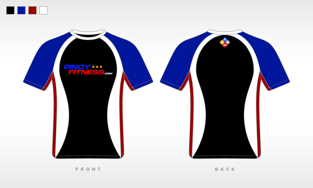
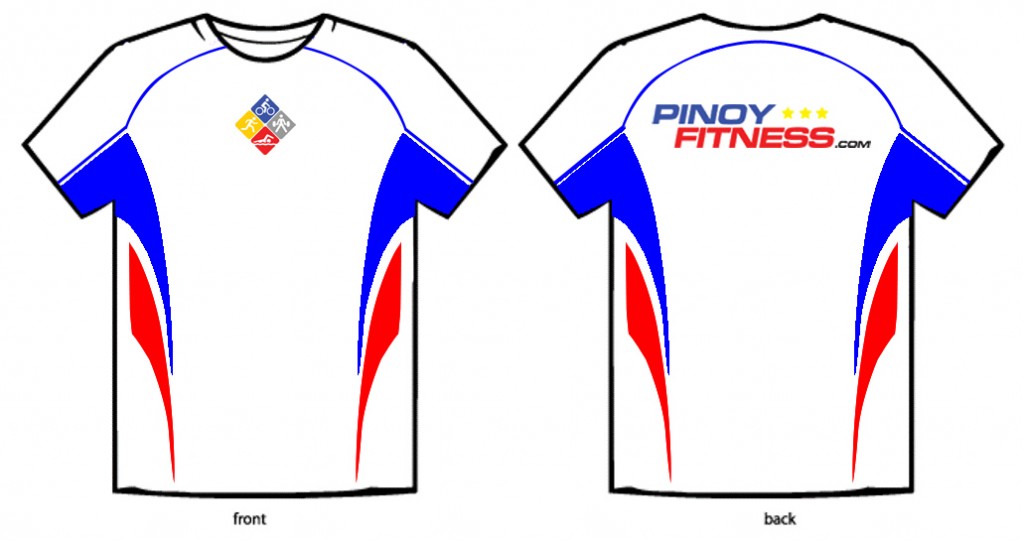
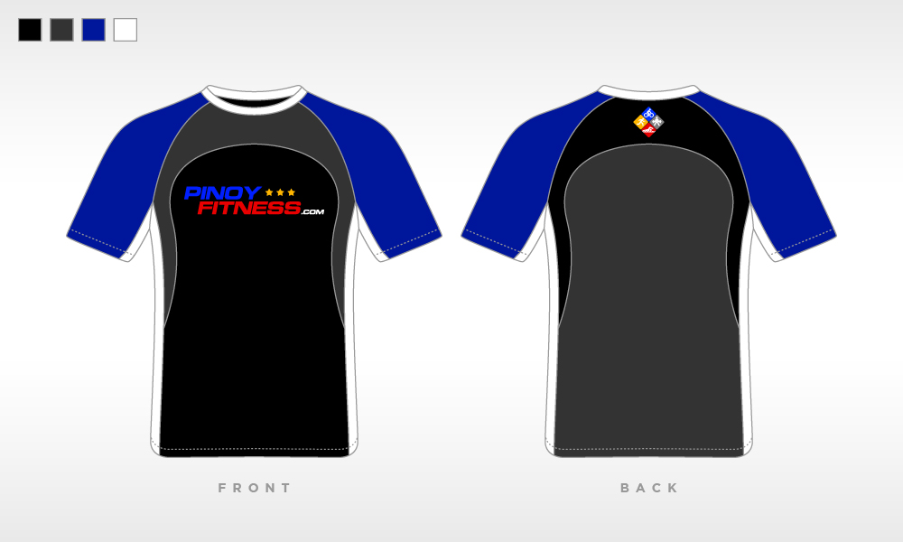
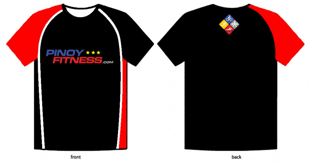
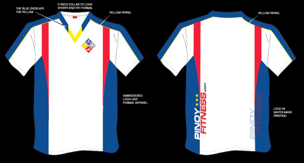
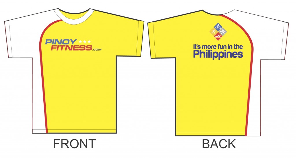
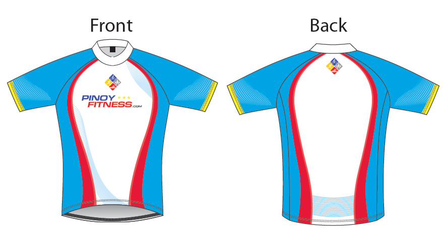





voted for Finalist #1!
voted for #10.. good luck
huwaaaw! ALL have very nice designs and concepts. Ang hirap tuloy mag-choose.
Dapat pala Mr.PF may option to pick at least 2 designs, hehe.
Congrats to ALL Finalists, ang galing!
huwaaaw! ALL have very nice designs and concepts. Ang hirap tuloy mag-choose.
Finalists #11 and #15 are potential TriSuits.
Congrats to ALL Finalists, ang galing nyo, good luck po
ayan, okay na, got to pick my Top 3 choices, sna isa sa kanila manalo. woot woot
lahat magaling pero i vote for finalist# 1
go for #1 kc nandon n lahat ung design na gus2 ko.
voted!
suggestions:
1.me reflector, para sa night/early am runs
2.me secret pocket
tnx po!
voted 1,3 and 4 :-) good luck po.
gusto ko yung finalist n#11,para syang pang scuba ang dating,yung color nya iba,unique sya.opinion lang po,
Nagandahan ako sa 1 and 2! Haha
I forgot, i agree sa suggestion ni questar.
1.me reflector, para sa night/early am runs
2.me secret pocket
Although kahit reflector nalang, kasi mukhang masyado na mahirap kung may secret pocket pa. Hehe
yung number 1 ok sana kaso it just look like the same as the other shirt ko ng pinoy fitness, parang tech shirt na jeepneyed lang sya, sana ang manalo yung someone unique and different from the other design ng pf shirt na narelease na kasi otherwise walang sense yung contest. this is my own opinion lang ang.
#8,#12…and #14:)
1, 7, 8 & 10 are good designs. No. 1 is stunning followed by No. 8 while 7 and 10 showed the traditional colors of pinoyfitness shirt. I want something new, I’ll down list to just between 1 and 8.
nice design ng # 1 at 8. vote ko yan.
done.galing!dami maganda..can i choose 4 designs instead.. :))
just my own two cents:
Numbers 8 and 11 maybe strong contenders:
Yun 8 simple but eye-catching and hindi mukhang madaling ma-luma…
Yun 11, depende sa material puwede siyang pang-triathlon….(I think…)
I am not an expert so my opinion is just based on instinct…. :)
Good luck to all designers here…! :)
sana Black/Dark version yung manalo, since White yung base color nung 1st PF Tech Shirt! Congrats to all the finalists! Goodluck! :)
very nice comments po. keep them coming…
gusto ko yung mga design na lakas makapayat sa mga healthy na tulad ko….. hahaha…
Nice Designs everyone!!! Manalo or matalo, cool pa rin!!! CONGRATS !!!
Nakaboto na ako ng top 3 choices ko. Sana din isa sa kanila manalo. Pero maganda naman lahat kaya ok rin lang kung hindi.
Just finished voting for my top 3 picks…
hoping that one of them will win…
kudos to all participants of this Pinoy Fitness Tech Shirt Design…
More Horsepower Guys!
dalekado (Dale Basas Prado)
the best yung design nung 9 and 11.
Wow! ang ganda ng mga design nila..Congrats! nag send din ako ng entry ko.. ok lang kong di nila nagus2han… may suggestion lang ako dun sa # 4, 5, 7, 8 sana nasa ibaba ang kulay Red at nasa taas ang kulay Blue,kc parang Philippine Flag ang tema ng Design d ba! yung reflector ako nalang mag lalagay, madami ako nyan… tnx. I vote # 1
Yung reflector ako nalang mag lalagay pagnakabila nako..
Sana may free winning PF shirt lahat ng nag-submit ng entry kahit hindi nakapasok sa finalists. Hehe. Suggestion lang nman :) what do you thing PF family?
very nice design, baka naman me long sleeve model para abutan man ng init sa katatakbo e me protection sa init.
Boto na!
sana nga may long sleeve version…i voted for design #1 because of this “LIVETORUN”. =)
ahhhhhhhhhh…. can’t decide which one is the best for me… all are awesome!!! can we produce all? hmmmmmmm……pls pls pls……
#2,3,4……
i vote #9.
i vote #11.
I vote for #9 AND 11 ganda ng design!!!! sana manalo alin man sa isa dito…
ang # 11 and # 9 ay simple lang sa mata tingnan ..parang compfortable din isuot sana wag lang mainit sa katawan pag sinuot…sana ang manalo lahat ng nag vote may free !je je je …if pwedi lang nman..
designs 2, 3, & 12
comment/suggestion
#2 – remove the ‘pinoyfitness.com’ at the back
design #8 looked like the camsur marathon design
comment lng sa finalists 4 & 5.. since we are using blue and red to symbolize the Phil flag, dapat ung blue ung nasa taas instead of red sa shirt design 4.. at dapat blue ung nasa left sa shirt design 5 para kapag tinurn mo, blue ung nasa taas and not red. i voted for 4, 3, and 15. Just in case manalo ung design 4 or 5, sana macorrect ung color placement. thanks sir PF! :)
#8 because:
a.) Catches the eye, Something to remember
b.) Simple, yet smart
c.) Timeless
d.) I super like it!
e.) wearing it . . . PRICELESS!!!
ang gaganda ng design. . ang gagaling :)
1,7,8 ang vote ko…
Lahat halos magaganda ang design.. Mahirap tuloy pumili :)
SANA ANG PILIIN NYO UNG HNDI WHITE, PARA MAIBA NAMAN….para meron naman tayo variety sa tech shirt…just want to share my opinion..Thank you :)
T@#! Ina N@#!! Gera ba gusto nyo? ung pula nasa taas! haha
don’t vote for white designs, kakasawa na majority ng running singlets and tech shirts white na.
feng sui says that yellow is the color of year 2012
I voted for finalist numbers 2 8 and 15. All have a great designs. Good luck guys!
ako yung n#11 wala syang katulad na kulay,sana manalo,kung di sya manalo,sana piliin sya para sa new design,
suggestment ko lang sa #14 sana black n yellow ang combo colors ng shirt – tipong yung yellow portion e black tapos yung white portion ay yellow (or vice versa) .. wala lang .. testing mo daw designer – kung sino ka man. testing lang .. tapos post mo sa fb page ng PF .. hehehehe …
According sa protocol (kung patayo ang flag katulad ng finalist #5) dapat nasa left side ang blue at nasa right side ang red. Nasa taas dapat ang blue at nasa baba ang red (finalist #4). Sa finalist #3 ay kitang-kita ang name ng designer kaya wala ng lihim kung sino sya (see lower left side). Good luck sa lahat!
no. 2
whoever wins…clap! clap! clap! to all 15finalists!!
galing!!!
Tsaka may hover din. Pag nag hover kayo ng mouse, may name yung bawat entry.
agree ako kay Papa B pagdating sa protocol especially kapag involved and flag colors. Pero Papa B, whenever you click on the photo, it will show the name of the designer as jpg filename. :)
wow!good job guys!amazing design!pwede lahat nlng yan??haylaveet!^^
really admire #4 and #12
#8 is a good design too..
and now napansin ko ang #3.. it looks well too..
Ang protocol ba na yan is involving yung colors representing the flag or for the flag itself only? kasi kung for the flag itself only, free-for-all ang color placement nyan..otherwise, mali nga..
Do you have plans to mass produce all the shirts? Coz I’m liking Finalist#4,it’s definitely a girl-friendly shirt. Maraming bumuboto for the 3rd shirt, pero I’d definitely buy the Finalist 4 shirt. Hehe, pati si Finalist 5 and 13. Collectibles!
Do you have plans to mass produce all the shirts? Coz I’m liking Finalist#4,kc it’s a girl-friendly shirt. I’d definitely buy the Finalist 4 shirt. Hehe, pati si Finalist 5 and 13. Collectibles!
wow…. galing ng mga design, congrats to all participants kaya lang isa lang dapat ang maging top. . . .
#4 for me.
the best sana un # 15 if only they use dark blue instead of light blue.. pero pinakamukhang pang professional sya
ang daming pagpipilian,magaganda naman lahat.GOOD LUCK SA LAHT NG SUMALI..
the best yung #2, safe yung color kapag nabasa na ng pawis, ganda ng designs nya…like like like
My vote is for #13 kse unique ang design, sporty ang dating at the same time pwedeng pang formal…thanks po! My God bless all the finalists….
I voted # 13 :)
I Vote for Finalist #2.
finalist#2 seems to be the best, color wise its unisex, design wise its so cool and sporty….
i vote for finalist #2. nice.
I voted Finalist #2, very unique yung design & maganda yung color combination.Go Finalist #2
Voted for number 3. Simple lang pero kapag nakita mo yun na suot sa malayo, makita mong symbolical agad ng flag ng pinas.
voted for #4
Ganda!
sana drifit din ito :)
i vote for number 1..ang ganda :))
finalist#2 seems to be the best, color wise its unisex, design wise its so cool and sporty….
Finalist #2 super ganda!
ganda ng finalist #2 paki vote…
ganda ng finalist #2 plz. vote, thanks…
Go Go Finalist #2, I really like your design very nice! You deserve to be in the top 3,very unique!
i vote for #2.
I’m please to vote #2, nice color, eye mesmerizing and sexy to wear.
i voted for finalist #3..simple lang naman kasi.. ang instruction lang namn kasi eh ang design ang kailangn ay nag symbolize ng flag ng Philippines… it seems na andito na lahat.. unlike sa iba.. bakit may black.. at why puro white…
@pink- agree ako dyan:)
In my own opinion the best ka Finalist #2, the color is safe, the design is unique…super ganda cguro once ginamit yan sa funrun ng pinoy fitness kasi class yung design…Please support Finalist #2.
Yes po. Let’s vote for finalist #3, it has all the features of the Philippine flag which is the concept or general idea of the contest. Simple pero astig ang dating! And it doesn’t look like a cycling jersey like with the other finalist.
pink, ronron wag manira ng gawa ng iba.
di namn po ako naninira ng gawa ng iba.. im just saying the truth… and its only my opinion. meron namn po tayo sariling opinion, at sariling pag iisip..
@pink : one of the instructions states that it should have a “Pinoy Theme,” not necessarily the colors of the flag po or something that symbolizes it. and you said “bakit may black.. at why puro white…” Well respect nalang po sa mga designers, kayo na rin po ang nag sabi na “meron tayong sariling opinion at pag iisip”, Just like designers, they have their own creative ideas and interpretations for their entries. Maybe the reason why they decided to choose black as a base color is because they wanted to design an inverted version of the first/current PF tech shirt which is white.
@ pink, fmcc, the Philippine patriots and the Philippine all stars use black with red/white blue & yellow designs and maganda ang gawa nila.
Iba ang opinyon sa paninira at pag impluwensya.
PF,WHAT IS THE LATEST NEWS ABOUT THE CONTEST?
hey i thought Voting Period: Feb. 1-8, 2012??? But I checked this morning & still the percentage change from time to time! What’s happening????
tapos na ang voting period. Mga supporters Itigil na ang botohan, be fair LOL.
hey bkit until now umaakyat pa ng percentage?”HEY PF FAMILY” anong nangyari?
@sorry guys. forgot to close it last night. will tally scores already.
The Winner for the Contest:
3rd Place – Finalist #2
2nd Place – Finalist #4
1st Place – Finalist #3
Congratulations Guys! Thanks for joining! I’ll contact you guys individually.
pwede po b ung tatlong finalist (2,4,3)tshirt ay pwede ma-avail? for collections..thnks
congrats to all!!
Yehey! :)
Congratulations! Dustin
wala pa ring contact sa mga winner..hey PF FAMILY inaantay na ;po namin ang note nyo or message..thanks po!