Hi Guys! I’m planning to create a technical shirt for the Pinoy Fitness Community! Need your support to vote and give comments and suggestions on the shirt design.
Cast your Votes!
Also please leave your comments and suggestions below! This is still in its conceptual phase and can greatly improve with your feedback. Many Thanks!
Please Forward, Re-Tweet and Re-Share to friends as well.


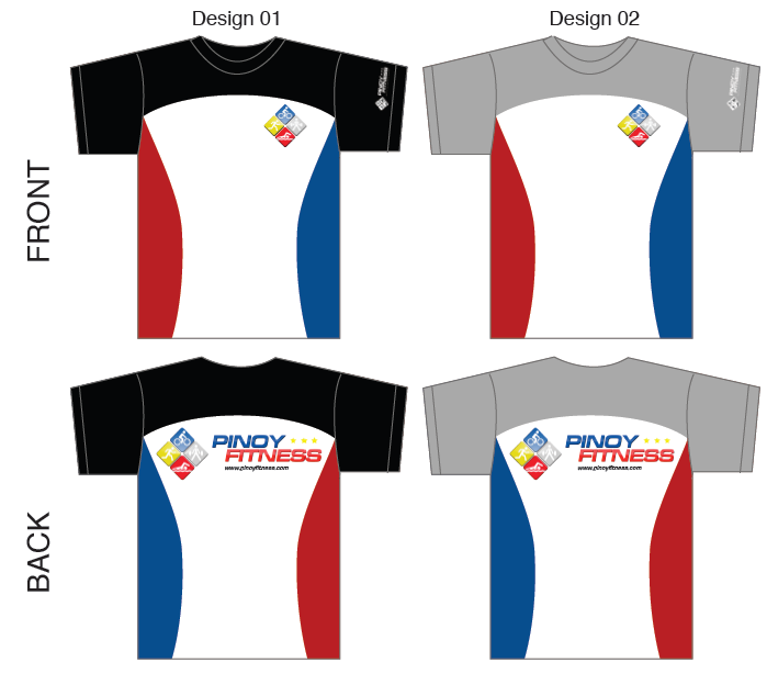
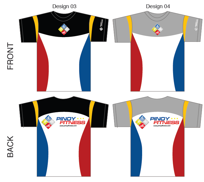





front design may be ‘wrong’ since the red color is found at the left side. when the flag is hung vertically, the blue color must be found on the left side. but by doing so, the flag will again be wrong from the back side. maybe re-check the rules on using the flag colors?
@A: noted. baka yung likod one color nalang, kasi baliktaran. hmmm
i think the upper color (black & gray) doesn’t blend well…
suggestion lang po…
Modification of Design 03
– shirt all black (or all gray or all white) and maintain all other color combination
– Front design: put the logo in the right (like the one in Design #01)
Just imagining things up, but design 03 is ok for me :)
I like gary m’s idea. It would be better kung all black, and the logo is on the left
i agree with gary_m.
i understand its hard to design a shirt,so i vote design 1 w/ the ffg add-on n lng, f evr possible:
1. our pf name &/or signature at the back or front above upper pf logo corner
2. reflector(s)
3. secret pocket
tnx!xctd 2 hav 1!
I voted for design 4, but i think the back design should be in front. You can remove the front design(The LOGO)It’s redundant already.
@pinoyfitness – ang galing! now I’m more confused hahahhah
hhmmm ako rin, pwede parang smorgasboard of designs? hehe…but id still prefer the PF logo to be on the upper right hand, facing the shirt …like that of Design 1 and the black has a very good classic effect.
keep the ideas and suggestions flowing peeps!
Like #3 but, confirm flag position, remove front center logo, use smaller logo and put it on the left side. I hope the material is dry fit.
wow !!! i voted for design 1 . i like d combination of colors
Question: What is the material to be used here?
(Gore-tex or Dri-Fit?)
@edrick
accdg to PF, its going to be DRI-FIT material.
I voted for design #3 but as others suggested I would like to reiterate that the front logo should/can be put just like in design #1. Also the back logo should be omitted, retain the Pinoy Fitness text and website address. :-)
Nice idea po. looking forward to it…. cant wait to have one…
san po makakbili nyan kpag may available napo?
yep,i agree with @desperatedaughter, sa forums pa lang gusto ko na isuggest ang PF name somewhere sa shirt..sort of like our built-in personalized bib…whatch-all think?
in that case. makilala pa din natin PF buddy kahit iba na itsura nya sa pawis at sa di na makangiti sa pagod hehe ;)
anyway suggestion lang to mga bossing! kahit ano ilabas nyo, bottom line is..I WANT SOME :))
I voted for design #3. I agree with comment #13. at yong font sa back ‘wag masyado malaki. yong “pinoy fitness” one line tapos yong web address subtext (small pero readable), yong logo sa front dapat reflectorized. Sana maganda yong materials na gagamitin sa technical shirt and pwede gamitin sa running and biking. Go design #3!
mas bet ko yung #1. For me mas magandang tingnan if the logo is on the left side.
uhmm, can we put a tagline sa shirt? like “running is our passion” or “we live a healthy life” something like that. hehe suggestion lang po. I agree with redcapguy, whatever the result will be, i still want to have one! cant wait to wear the shirt
Ang suggestion ko naman, kung puwede sana logo at “Pinoyfitness.com” sa harap, then sa likod, slogan.
Example ng slogan could be, “Takbong Makabayan!”, “I Believe in Running.”, “PINOYS ON THE RUN”, or other short slogan that you can think of as print at the back of the shirt.
I like design 1 and design 2. This is a tech shirt so it’s gonna be a dri-fit right? I hope we could also have a shirt that you can use any day. :)
pwede po ba ako maging member dito? :-)
@edward
hi there ed!
all you have to do is sign up at the Community Forum by clicking on the upper right hand side of this page. join us also in the many topics in progress.
enjoy your stay here! ;)
great thank you! :-)
i like design 04 except that prints in front and back should be switched (small logo at the back, big prints in front) come on, you dont put the big logo in the rear. backpack hides it, if you’re seated in a bus, jeep, fx, mrt you hide it. but whichever the popular design will be, it should be the big logo in front.
i dont like the designs with black sleeves. black is very strong and it’s robbing the blue & red color with much attention.
trust me… =P
overwhelming reply! thanks guys! picking up some really great comments, will work on 2nd iteration of this concept :)
lahat naman magaganda!! pero prefer ko yung #2.. tsaka maganda sana yung quality ng gagamiting tela and yung cut. *aprub to sir! :) cant wait!
and btw, yup!! agree with my PF buds!! sana pwede pesonalized para magkakilanlanan ang mga PF peeps!
put three (3) star at the back
//Design# 1: if i have to consider the front design, the blue should be on the right side [of the person wearing the shirt] and red on the left side [of the person wearing the shirt].we can disregard the position of the blue and red colors on the back.the PF logo on the left chest. do away with the yellow (or is it gold) accent on the sleeves.
//i suggest an all white shirt, PF logo on the left chest. maintain the PF logo at the back.
//Or, all white shirt. the logo at the back printed in the front instead. and like what the others had suggested, tag line printed on the back.
//way to go…! @pinoyfitness…
@Ms_Mars: @Bingski: @joeyboy80: this is what we’ve been talking about…this is it..!
I like design 1/2 except for the black/gray part. Maybe you could add up the yellow part of design 3/4 to 1/2 to complete the flag colors and remove black/gray. :)
yupz! this is really it, @Suplado
one night our group were discussing about the design of the shirt during the Meet ‘n Greet @Teriyako Boy and now few wks later, the design options and out, wohoo!
Very fast track, @PF
may the best design win! ;)
maganda nga idea ni gamy_m.
It would be nice to have isang color lang yung top and bottom part tapos retain the other colors. Maganda din yung idea na plain color na lang yung sa back tapos just place the logo sa gitna na mas malaki with the name below it.
Hehe, just a suggestion kahit na medyo parang gumulo lalo.
I like the logo placement of Design 01, but I prefer the sleeve design of Design 03. Less colors in the body design = less cost = more affordable = more publicity!
How about coming out with a singlet design? =) Perfect when I go running!
sana may collared na version para pati indoor sports pwede =P
i’ll go for design 01 or 02…simple! =)
– stick to 1 – 2 colors
– left logo (near heart) -front
– add tag line
– just a readable fonts (pinoy fitness) – back
– the simpler the better
– reflector if possible
Design no.2 is okay for me. Logo in front is correct (left) but should remove back logo.
ok sa akin ang design #3. pero ok kahit alin ang manalo sa botohan.
sana meron din para sa singlet.
any of the design above is good. the quality of the fabric is important if it is intended for running. reflectorized is good for dawn and night running.
I think it would be better if the cut is for singlet instead. And pls, avoid making too much grandiosity in the design. Keep everything simple like the Takbo.ph.
I suggest design No.4 is more appropriate simply because it represent our malayan race which is “Pinoy na Pinoy” talaga. ty gblss
I vote for design #2. Nice combination at maaliwalas sa paningin.
ok naman lahat ng mga comments but for me mas type ko sana yung simple lang pero may dating. I mean wag masyado marami kulay. Tama si Suplado na ok if white shirt na lang kaysa sa black or grey kasi dagdag kulay ulit yon. At yung comments tungkol sa tamang posisyon ng blue and red ay dapat tama rin kaso sa unang tingin ko kanina akala ko Czech Flag yung dating hehehe..
Pwede rin maging French flag kapag patayo ang yari. As in blue/white/red if kaharap mo yung may suot. More brain storming pa!
I voted for design #3, but I’d suggest that you use a brighter shade of yellow.
More power!
If I were to speak the truth, I’ll tell everybody here that the design isn’t really impressive. May iba pa bang design?
make it 2 to 3 color combination
design no. 3 light and dark color combination…intersting logo in front tapos pag lingon sa likod WOW un pla bagoshirt ng pinoy fitness.. makabili nga hehehe
Design No. 4 is the best. Just make the white portion gray also para di dumihin tignan saka di masyado maraming kulay.
design 1 ako…
DESIGN 2 for me..mas ok sana kung andun parin yung YELLOW na color sa armpit para mukha na tlgang flag ng phl..just my 2 cents :-)
Design #3
Front logo on the right please (same logo place as no.1)
@pinoyfitness: Can you instead reverse the design? Pinoyfitness is in front and the logo at the back and make it bigger so people would see the pinoyfitness name right away.
@pinoyfitness: Also i like the colors of design 1 & 4 butas mentioned earlier, the pinoyfitness name is in front, the logo at the back & much bigger.
@cecille: for me Design 01 & 02 not that too colorful and then yung suggestion mo…”Pinoyfitness in front & logo at the back”! =)
@c21: Hey musta? Are you gonna run in YAMAHA? Ang ganda ng finisher’s medal. 21k ako takbo, prepping for milo. Wala me running buddy kasi, all my co-runners in my team opted for Milo, mas mura. Ay sis, meron pa pala takbo.ph, sunday before milo, i’ll register for 16k, ikaw feel mo ba?
suggestions: i think it would be nice if we could also personalized it, we could put our a.k.a. under the PF logo on the front left side of the shirt, i like the design 1, PF on the back is better for me…
kelan po target release ng shirt?
@cecille: i’m fine! not able to run this month because of an injury from my last climb…i’ll register today for 21k din. sana meron pa. ilang km ka sa Milo?
I’m for design number 2.
@cecille: sa Rexona Run takbo ko…i have 3 21k run this month in preparation for Milo. i’ll see you then sa Yamaha and maybe sa Milo. =)
@kinetic
no target release date yet for the PF tech shirt since all design reconsiderations are sitll being consolidated.
acdg to PF, the revised iteration #2 of the shirt design will be out soon.
thanks for standing by!
@cecille
see you during the Yamaha run, my dear…
@c21
second the motion, hehe!
i will wait for the revised design.. my comments are the same as others
sana mga bright colors…medyo patay kasi ang black at gray..pero depende sa tela na kayang buhayin ang ganyan kulay…yung wordings sa likod sana medyo maliit lang na above gitna..suggestion ko lang po.salamat
ok kaya kung yung gawing front design e yung nasa back logo ng mga designs, tapos yung ilalagay sa likod yung nickname, hehe
OR
yung gawing front design e yung nasa back logo ng mga designs, yung nasa likod e short quote about running, and then yung nickname nasa left sleeve, hehe
opinion lang po, hehe
design 1 football style, mahalay lang ang logo sa gitna sa ibang designs
I like the design no. 3
any updates
i agree with gary-m that the black,gray or white color should extend to the bottom of the shirt, (but i preferred white), and the red and blue like in #1 stays. but i think the logo in the front should be a nice if its a bit smaller. the design was so simple but it says all. hoping i can have one of this. thanks
I voted for #3. But upon reading the threads, mas ok ang #1, except of course blue shud be at the right. Logo must be in standard size which is usually at the left breast.
Adding reflectorized material is a good idea for visibility purposes at night.
with all honesty, the lines and color are all dull. try to stick with a 2-tone base color on flowing lines, the event name in front, then your logo at the back. look at previous event shirts at least.
i like 1 or 4 pero mas maganda kung nasa front yung name nun “Pinoy Fitness”, me dating sa tao at mas nakikita ng tao and for advertising n rin….. suggest ko lang…
pwede b makabili ng Pinoy Fitness Technical Shirt yung dating design nyo magana kc… i need your reply saan pwede makabili….. Thanks
pwede b makabili ng Pinoy Fitness Technical Shirt yung dating design nyo maganda kc… i need your reply saan pwede makabili….. Thanks
@ruel: thanks for the support! i’ll announce when and where you can grab a tech shirt soon :)